
Morganics
THE PROJECT
A broad pantry range needs more than a logo on every pack. For Morganics, the work connects brand foundations, a botanical identity and practical packaging into one recognisable presence. The case study follows that progression, from the thinking behind the brand to the way each product is presented.
Start with what the brand stands for.
Morganics brings many ingredients under one name. The guidelines begin by defining the positioning, values, personality and audience that the visual work needs to express. These foundations give the identity a purpose beyond the packaging.
One M. A whole world of ingredients.
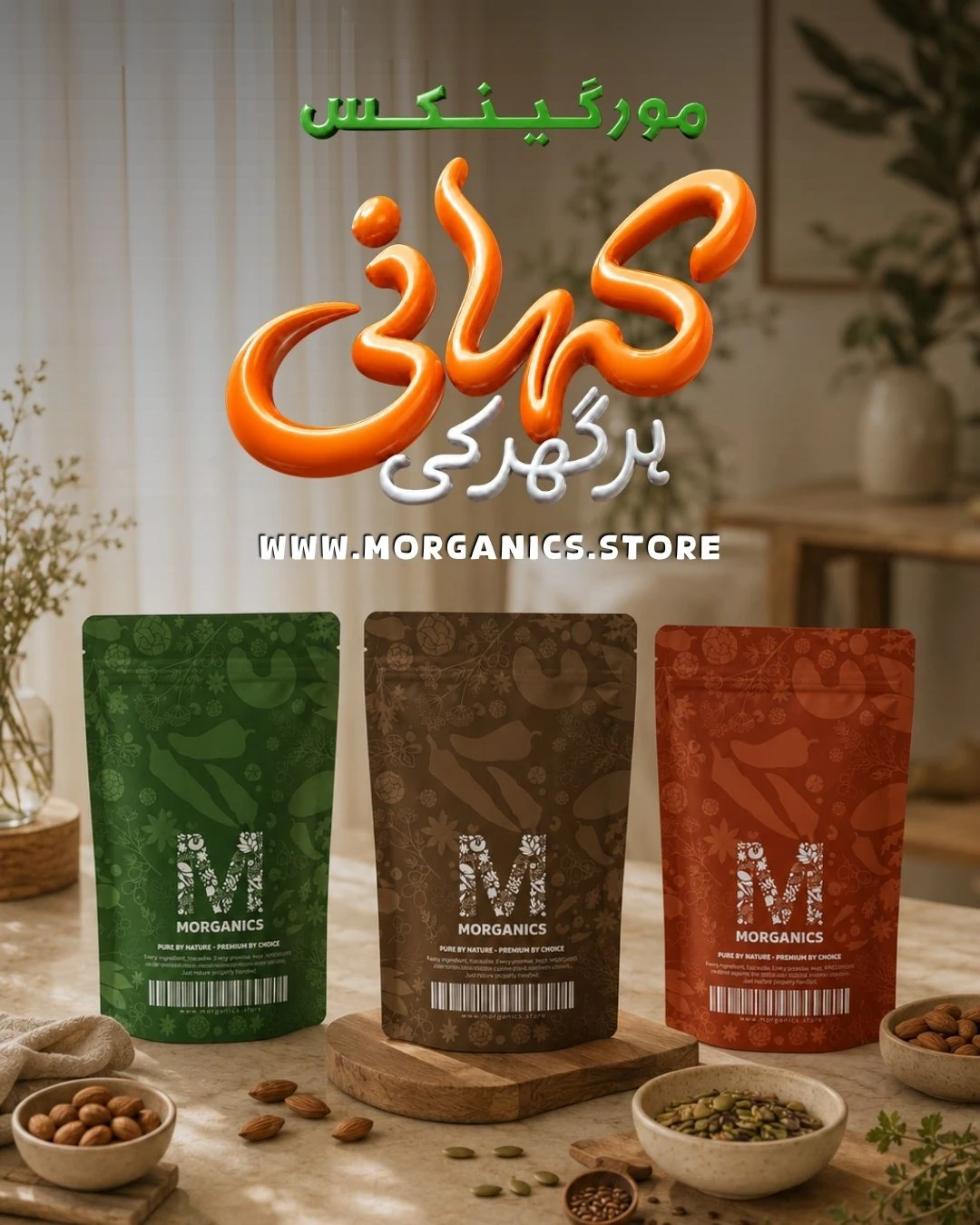
Botanical and ingredient forms give the monogram its character. Colour roles, typography, logo variations and English and Urdu wordmarks turn that idea into a flexible system. The exploration sheets show how the mark developed before it moved into everyday applications.
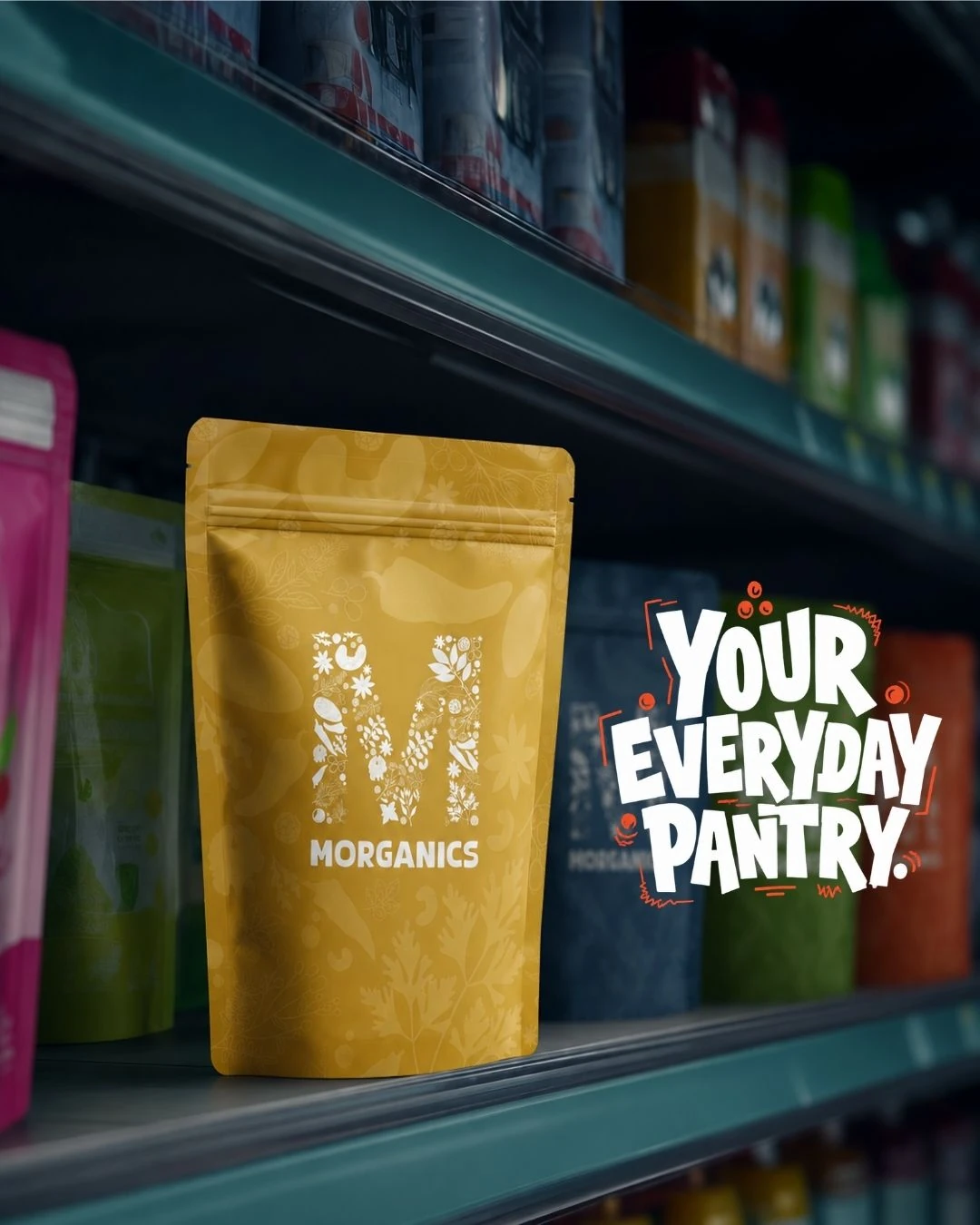
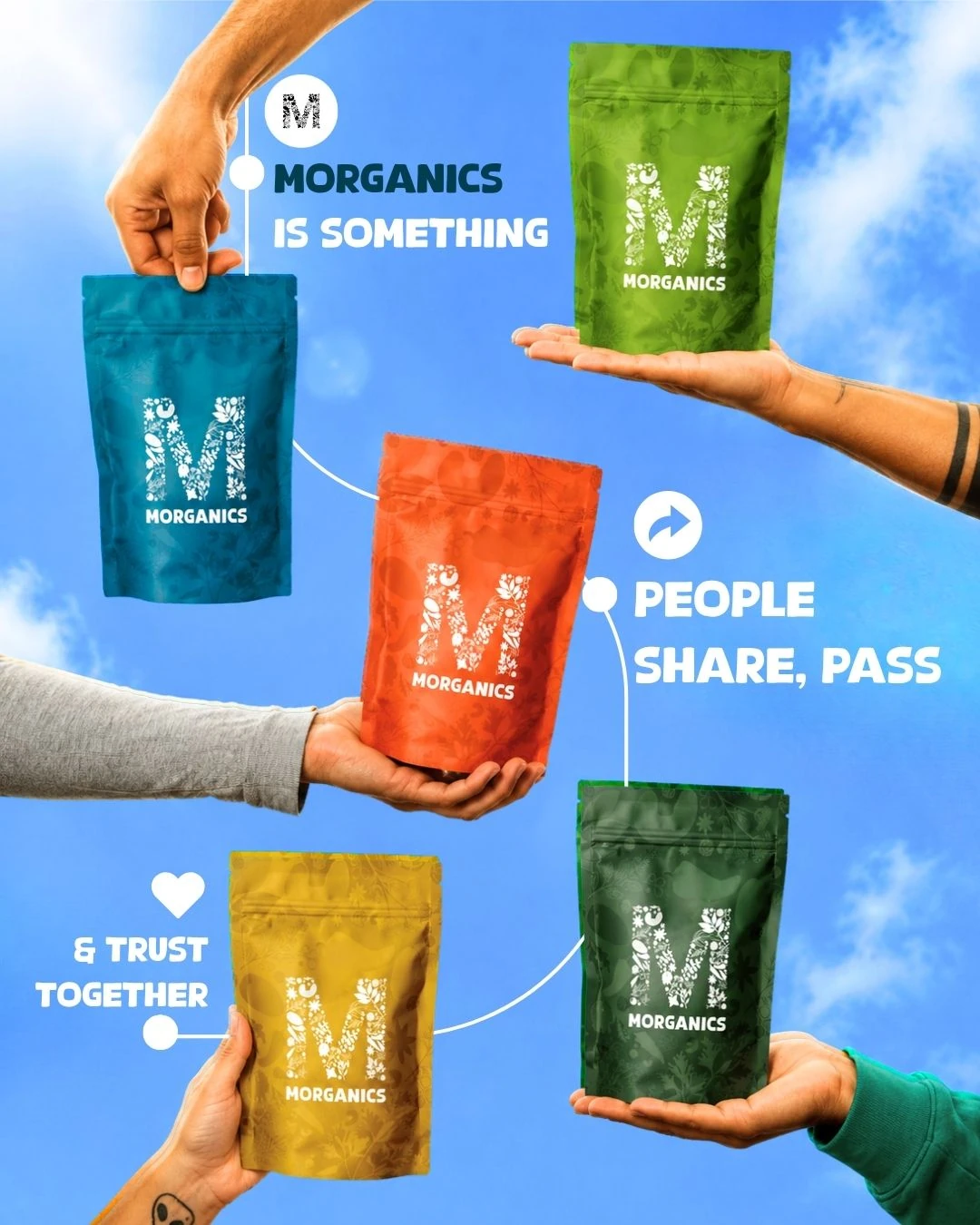
Different products. A shared shelf presence.
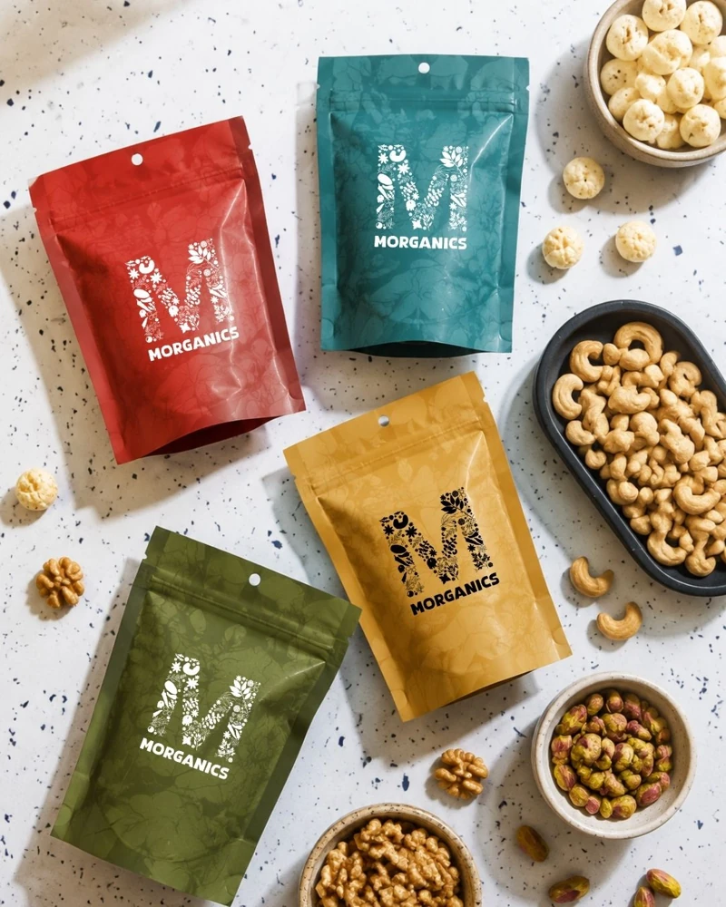
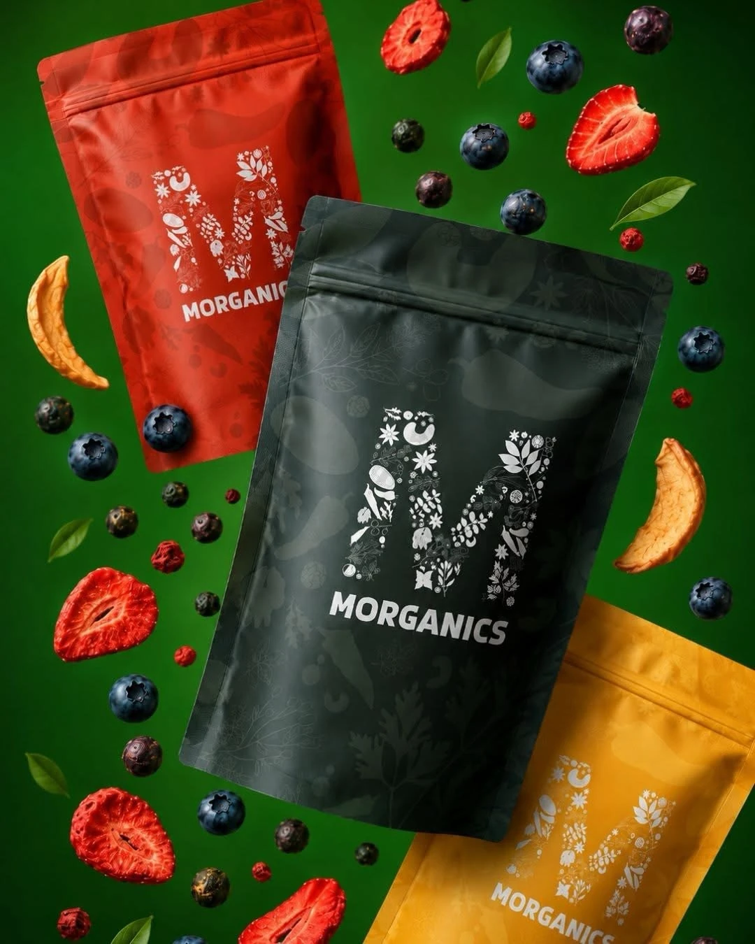
Jars, pouches and boxes need different layouts, but they still need to belong to the same family. The product range uses the mark, supporting colours, product imagery and information hierarchy to balance variety with recognition.
Carry the identity beyond the pack.
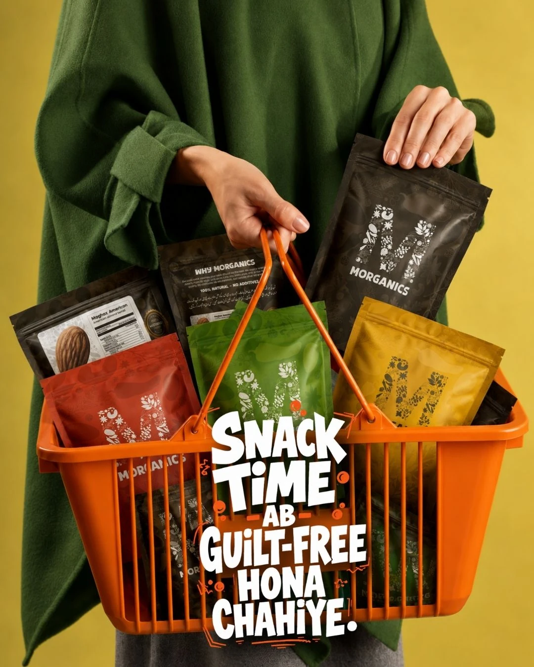
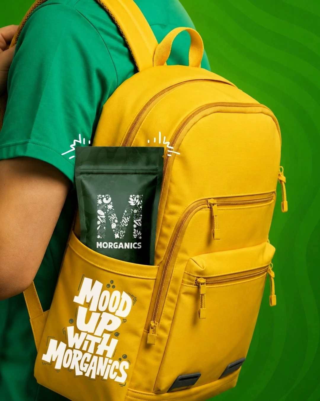
Outdoor, print, stationery and merchandise extend the visual language beyond a single product. These applications show how the same identity behaves at different scales and across different materials.
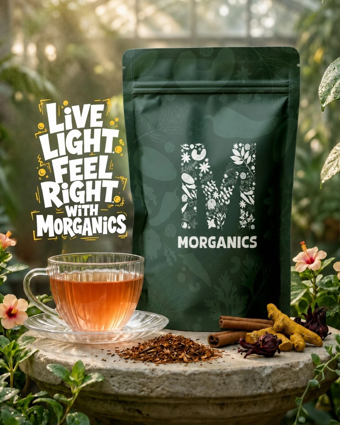
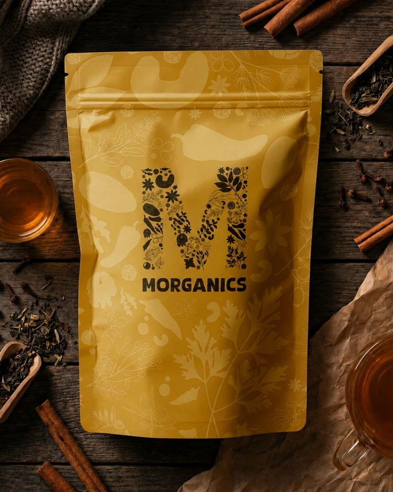
Let the ingredient lead the scene.
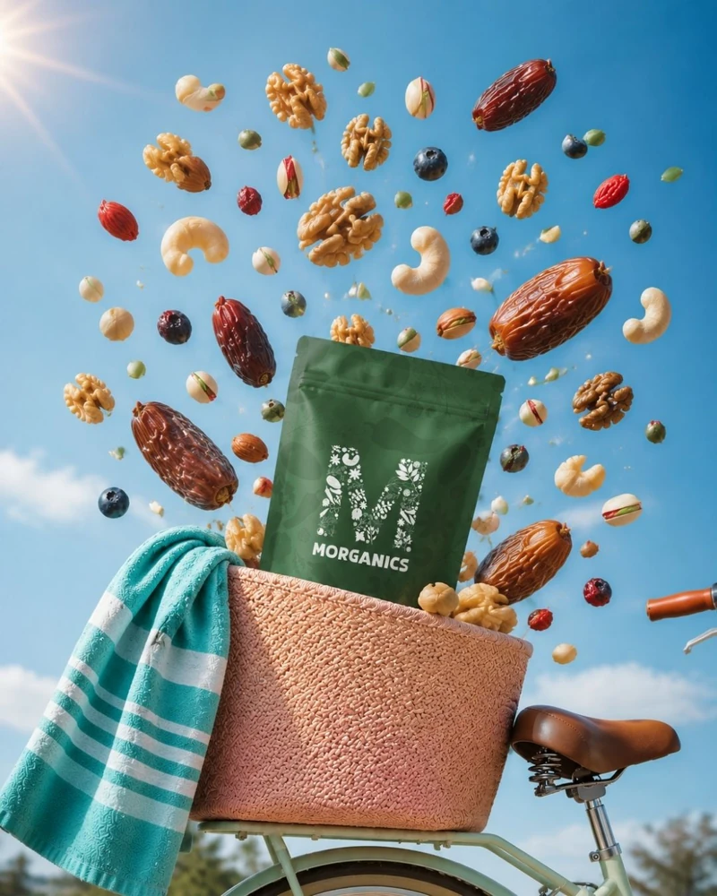
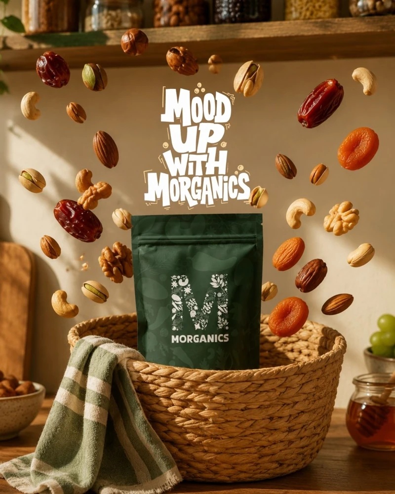
The product visuals pair packaging with the ingredients and settings that give each variant its character. Close ingredient backgrounds alternate with more atmospheric scenes, keeping the product recognisable across the collection.
The project at a glance.
The cover brings the product, botanical language and green palette together in one compact introduction.
THE COMPLETE SYSTEM
- Brand positioning and audience guidelines
- Botanical monogram and logo variations
- Colour and typography systems
- English and Urdu wordmark applications
- Jar, pouch and box packaging designs
- Printed collateral and brand applications
- Product presentation and campaign visuals
Have a project in mind?
Share what you’re building. Let’s find a clear direction together.
Talk through my project Explore more work →